
PHOTO SUBJECT MATTER
The heads of Marketing and Web generally need to approve all photos used on our home page 'hero' sections. While there are no absolutes, these are the things we commonly find when we approve or deny certain photos.
Looking to hire a photographer at an upcoming event? Pass along these notes!
Want to only choose from the best pre-vetted images? Browse our Library (password = wbr )
Things To Look For
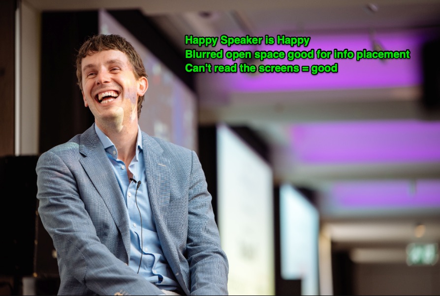
- First and foremost, we need to prominently feature people. Interactions and smiles are ideal. There are exceptions to this rule, but it should be our general baseline.
- If people aren't looking happy, they should definitely be engaged. If people look bored or on their phones, we likely can't use the photo.
- The subject of the shot shouldn't take up the full height of the photo. The photo needs to allow for some areas to get cropped out as the site scales up/down for various screen sizes.
- These items are not absolutely required, but definitely help make a great photo. The more you can check off, the better:
- Empty space for overlaying text
- Directional and/or colorful lighting
- Shallow depth of field (sharp subject, blurred background) can look nice
- People having fun (games, receptions, laughter, etc)
- Diverse crowds (gender, ethnicity, etc)
Things To Avoid
- Photos with external company branding, logos, or visible attendee name tags taking up a large area. These items have to be 'scrubbed' out of the image, which isn't always easy or elegant.
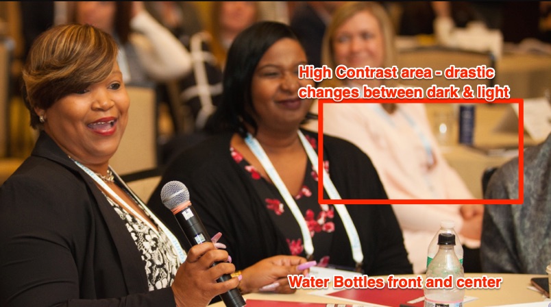
- Photos with distracting objects taking up prominent space: empty chairs, water bottles, exit signs, etc.
- Photos with high contrast between bright and dark areas are more challenging to work with and may require an overlay so text is not obscured.
- If using a single static photo as the focus, avoid 'staged' shots of people posing and/or holding drinks.
- Slideshows or collage images can branch out of this rule with varying subject matter (venue shots, cocktail shots, etc). See below.
Regarding Slideshows or Collages
- Slideshows SHOULD show varied subject matter. Ex: 1 Speaker, 1 Crowd, 1 Networking
- Ideal number of photos in a slideshow is 3. No more than 4 please. QA gets to be a serious struggle, and relatively few visitors will see the end photos.
- The first photo in the lineup should have people as the subject.
- Try to keep the subject of each photo on the same side of the shot (left/right/center), as the overlaying info must stay in a consistent (hopefully empty) place.
HERO LAYOUT / COMPOSITION
Having a good selection of photos is only half the battle - we also need to be sensitive to how the photos work in the context of the website: how it looks with information displayed on our around the images, and how it scales down on smaller devices.
- Overlaying info does not obscure the subject of the photo on any common viewports (see Viewport section below)
- Overlaying text is easily distinguishable and legible against background
- Nothing is cut off, or spills outside a container, on any viewport
- Clear hierarchy of heading/logo, text, and buttons
- If using the event logo on the hero: (a) isn't redundant with nav bar, and (b) doesn't obscure too much of the photo
- On mobile, the subject of the photo is not cut off or placed awkwardly.
VIEWPORT SIZES TO TEST
This is most relevant for the web team, but it helps to have everyone checking as many screen sizes as possible. The more eyes, the better.
- Smallest Device Size: iPhone 5/SE (Landscape + Portrait)
- Most Common Mobile Size: iPhone6/7/8 (Landscape + Portrait)
- Tablet: iPad (Landscape + Portrait)
- Common Desktop Size: 1280x1024
- Wide+Short Monitor Troubleshooting: 1330x500
EXAMPLES OF GOOD PHOTOS


EXAMPLES THAT DO NOT MAKE THE CUT


0 Comments